Accessibility Part 2 — Semantic Markup and Screen Readers

Assistive technologies are examples of the practical application of what’s often called the “semantic web” — the judicious use of HTML to describe the meaning or purpose of web content. Recall from the last article how a blind or visually-impaired person uses assistive technology to navigate the web — websites are read aloud by a screen reader from the top of the HTML to the bottom. Lacking visual cues, the user relies instead on auditory ones gleaned from the underlying HTML.
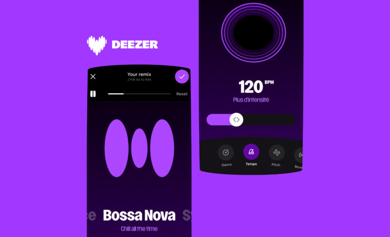
In this article, I’ll explain how to write accessible HTML for screen readers using semantic markup. To explain these ideas, I’ll return to the video from last week— a VoiceOver session on the unoptimized website, read by the voice Moira —to explore the problems raised, how to resolve them and to show how VoiceOver performs on a site optimized for accessibility.
. The shortcut Ctrl — Alt — A will begin reading the content. A guide to VoiceOver can be found here https://webaim.org/articles/voiceover/Content Headings
When we talk about semantic markup, we tend to think immediately of new HTML5 additions like <header> or <section>. Although important, more conventional elements like buttons, links or page heading tags transmit semantic information that is arguably more useful. Screen readers like VoiceOver have a feature called the rotor, available via the shortcut Ctrl — Alt — U, that tabulates page elements like this and permits the user to jump between them.
A heading — the tags <h1> to <h6> — marks the beginning of a distinct section of the content, ranked from the most to the least important.

The headings on the unoptimized site are symptomatic of tags chosen with visual rather than semantic meaning in mind. The level-5 headings for example act as Thumbnail subtitles; they do not follow a level-4 heading nor give any indication of context to the user.
Returning to the video, the first thing VoiceOver encounters should be a top-level <h1> heading containing the word “Deezer”. Instead, Moira tries to speak the site logo, a decorated link that happens to be the first active element in the page:
<div class="brand">
 <a class="logo logo-deezer" href="/en/"></a>
</div>
Here’s how the logo should be marked up:
<header role="banner" class="brand">
 <h1>
  <a class="logo logo-deezer" href="/en/" lang="en">
   <span class="sr-only">Deezer</span>
  </a>
 </h1>
</header>
We made the following changes:
- The
<header>element encloses the content, providing an additional semantic cue to the screen reader; - A
<h1>tag surrounds the anchor which itself contains the word “Deezer” marked up with the classsr-only. This CSS class moves the content off-screen, but its order in the HTML keeps it visible to the screen reader. - Finally, we add a
lang=”en”attribute to the<a href>. This is an attempt to ensure the correct pronunciation of “Deezer” in languages other than English. Sadly, this is not currently used by VoiceOver on MacOS.
Note also the attribute role on the <header> tag. This is our first encounter with Accessible Rich Internet Applications (ARIA) attributes, annotations that provide contextual clues and make it easier for screen readers to use interactive content. An ARIA role highlights an important landmark in the page and is available in the VoiceOver rotor landmark list.
For the remaining headings in the page, we must decide what the primary content is and how it’s divided into sections, then add semantic headings and eliminate presentational ones to produce a logical flow from most to least important.
With this work done, we have the following organization, presenting a cleaner summary of Deezer.com’s content.

Form Controls & Links
A screen reader speaks the textual content of a website until it encounters a focusable element such as a form control or link. Both form controls and links are special elements as they are automatically accessible — a <button> or an <a href> take focus and respond to mouse or keyboard interaction with no further work from the developer. If we instead choose a different HTML tag to carry an event listener — a <div> or a <span>for example — we must take special steps so the element is focusable and responds to the keyboard; the same goes for <a> tags without an href attribute. It’s for this reason that properly labeled form controls are recommended for all UI actions, and valid anchor tags to change the URL.
Let’s return to the VoiceOver rotor; here’s the list of form controls for the unoptimized site:

The top two items in the list are the next two spoken by Moira in the video — the search field and its button. Here’s how they’re marked up:
<div class="search">
 <div class="search-form" role="search">
  <label for="menu_search" class="sr-only">Search</label>
  <input type="text" id="menu_search" placeholder="Search" />
  <button type="button">
   <!-- svg icon, details omitted ... -->
   <svg></svg>
  </button>
 </div>
</div>
This looks pretty good — we’ve used the correct ARIA role and have provided a label for the screen reader. When Moira speaks she says “Search, search edit text, button”, reading the label, the input field and the unlabeled button.
Let’s look at how this might be improved:
<div class="search" role="search">
 <form>
  <div class="search-form">
   <label for="menu_search" class="sr-only">Search</label>
   <input type="search" id="menu_search" placeholder="Search" />
   <button type="submit">
    <!-- svg icon, I omit the details ... -->
    <svg aria-labelledby="iconTitle" role="img">
     <title id="iconTitle">Search</title>
    </svg>
   </button>
  </div>
 </form>
</div>
Here’s what we did:
- Enclosed the content in a
<form>tag and added a submit button to better communicate the purpose of these controls. We also moved the ARIAroleto the parent; a<form>already has its own implicit landmark role and we don’t want to override it; - The input field is given a
typeattribute of value “search”. Again, this is an additional clue for the screen reader. Older browsers will treat a search input as a normal text field; - We made the
<svg>icon accessible by adding a<title>tag. The ARIA attributearia-labelledbyreferences the titleidto tell the screen reader where to find the label text.
Moira will now speak this as “Search, search text field blank, search button”, which is a little better.
Continuing down the site menu, VoiceOver reads aloud the following items:
- “Visited link, home”
- “Link, Hear this”
- “Report a bug”
- “Link, 24×24–000000–80–0–0.jpg My Music”
- “Link, Favorite Tracks”
- “Playlists”
- “One”
- “Albums”
- “Apps”
#1, #2 and #5 are links and are correctly spoken by VoiceOver.
#3, #6, #8 and #9 are spoken as non-interactive text. Each of these opens a panel when clicked and should thus be rendered as buttons. Here’s how the markup looks in the unoptimized site:
<li>
 <a class="nav-link">
  <svg></svg>
  Albums
 </a>
</li>
As the link lacks an href attribute it never takes focus and its contents are treated as purely textual. If an anchor tag was absolutely required, we could force it to act like a focusable button by adding two attributes: role=”button” and tabindex=”0”. However in this case we can simply use a real button:
<li>
 <button type="button" class="nav-link">
  <svg></svg>
  Albums
 </button>
</li>
#7 is the content of the “new & updated playlists” badge. As this is a non-critical part of the navigation menu, we add an aria-hidden attribute to make it invisible to the screen reader:
<li>
 <button type="button" class="nav-link">
  <svg></svg>
  Playlist
  <span class="badge badge-info" aria-hidden="true">1</span>
 </button>
</li>
#4 is a link that contains an incorrectly marked up <img> tag. An image with a semantic purpose should always have an alt attribute explaining its content; for purely presentational images, an empty alt will make it invisible to the screen reader and that’s what we add in this case.
The final set of elements that Moira tries to read are the Player component and Flow. We’ll see in a later article how to make the Player and Flow fully accessible; for the moment, we can improve accessibility by using a combination of labeled <button> tags, the sr-only class and aria-hidden.
With these changes done, the form control list in the rotor now looks like this:

Skipping to Content
Despite these improvements, going through the menu every time you want to play a track or to launch Flow can get pretty tedious. There are a few ways we can improve this.
Firstly, we can add hidden links just after the site logo, visible only to screen readers, that allow the user to jump to the Player component or to the main content area that begins with the Flow player.
Secondly, we can make better use of HTML5 tags and ARIA landmark roles so, with the aid of the VoiceOver rotor, the user can easily skip to the important parts of the site. The most useful HTML5 tags & roles are:
<header role=”banner”><nav role=”navigation”><section>and<article>. Note that<section>should describe a distinct document section; an<article>should markup a piece of standalone content;role=”region”— we add this to areas of special significance in the page, such as the Player and Flow components, along with anaria-labelattribute that describes the region’s purpose;<aside role=”complementary”>— a piece of content ancillary to the page’s overall topic e.g. the comments on an Album page.

<header>, blue for role=”search”, yellow for <nav>, green for <article> and red for <section>This gives us the following list of landmark roles:

Final Result
So, how does Moira do on the optimized site?
Note how VoiceOver distinguishes between those menu items that change the URL — links — and those that perform actions on the same page — buttons. Note also that the site still has problems. The Player in particular needs some work, and we’ll get to that in a later article.
Finally, we talked here about how to improve the web platform in cases where a site is read aloud; in the next article, we’ll look at functionality that helps all users, the able-bodied and those with both visual and motor disabilities — keyboard navigation.