Accessibility Pt 4 — Focus Outlines, Color and Contrast
In the last article, we looked at how to manage focus when using the keyboard. By default, the browser will place an outline around the currently active element. Firefox, for example, adds a dotted border; Chrome draws a blue halo. This outline is added irrespective of how the element is given focus — whether via the keyboard or by clicking in the conventional way.
Many websites (Deezer included) override this behavior, removing the focus outline entirely in order to maintain a consistent design across browsers. Moreover designers often choose colors purely for aesthetic reasons, without considering how they impact legibility and contrast. Both these design choices impact users with visual disabilities, those with reduced visual acuity (due to age, for example) or those with conditions such as color-blindness.
In this article, we’ll examine how to tweak an existing design to give sufficient visual feedback to accommodate keyboard navigation and to ensure our content has enough contrast to be legible to as many users as possible.
Accessibility should ideally be something we think about from the start of the design process; as here we’re working with an existing site design that predates our accessibility improvements, the changes outlined below are necessarily conservative and incomplete. However Deezer has committed to making accessibility a company policy that will be a consideration in all future design briefs.
Focus Outlines
In the previous article, we used a Chrome extension called Focus Indicator to help debug the keyboard navigation functionality. Disable this extension and it quickly becomes clear that, despite our improvements, navigating effectively with the keyboard is near impossible without some sort of focus outline or other visual feedback.
Ideally, we would simply remove the CSS rules that block the standard focus outline and return the browser to its default behavior. However as accessibility was not part of the original design brief, the look of the site could be aesthetically compromised if we went down this route. Instead we look to reuse, where possible, the visual feedback that occurs when we “rollover” an active element using the mouse pointer — for example, the darker black background that appears when you move your mouse pointer over an item in the left-hand menu on Deezer.com.
In most cases, this is simply a matter of adding the focus pseudo class to the CSS rule in question:
// Before
a:hover {
 text-decoration: underline;
}// After
a:hover, a:focus {
 text-decoration: underline;
}
Other cases require the rule to be moved to the element that can take keyboard focus. For example, consider the following HTML:
<li>
 <a href="/settings">Settings</a>
</li>
A CSS selector that uses li:hover would work correctly using a mouse, but adding li:focus would fail as the <li> element can never take keyboard focus. Instead, the hover selector must be switched to the anchor tag.
Sometimes we want to apply a style only when navigating with the keyboard, and not when using the mouse. For example, following changes in the last article, closing a panel will return focus to the element in the left-hand menu that opened it. With a :focus CSS selector, the parent menu item will appear selected until focus is moved elsewhere. If we move the mouse pointer over another item while the menu is in this state, more than one menu item will appear selected at once.
The solution, as in the last article, was to differentiate programmatically between a close action performed by a keypress versus one invoked by the mouse. So, occasionally, don’t be afraid to implement programmatic workarounds to accommodate the expectations of users.
Color contrast
A good tool to check the legibility of your site content is the bookmarklet tota11y. Using this on the current site reveals areas of content that are likely difficult to read for those without full visual acuity.
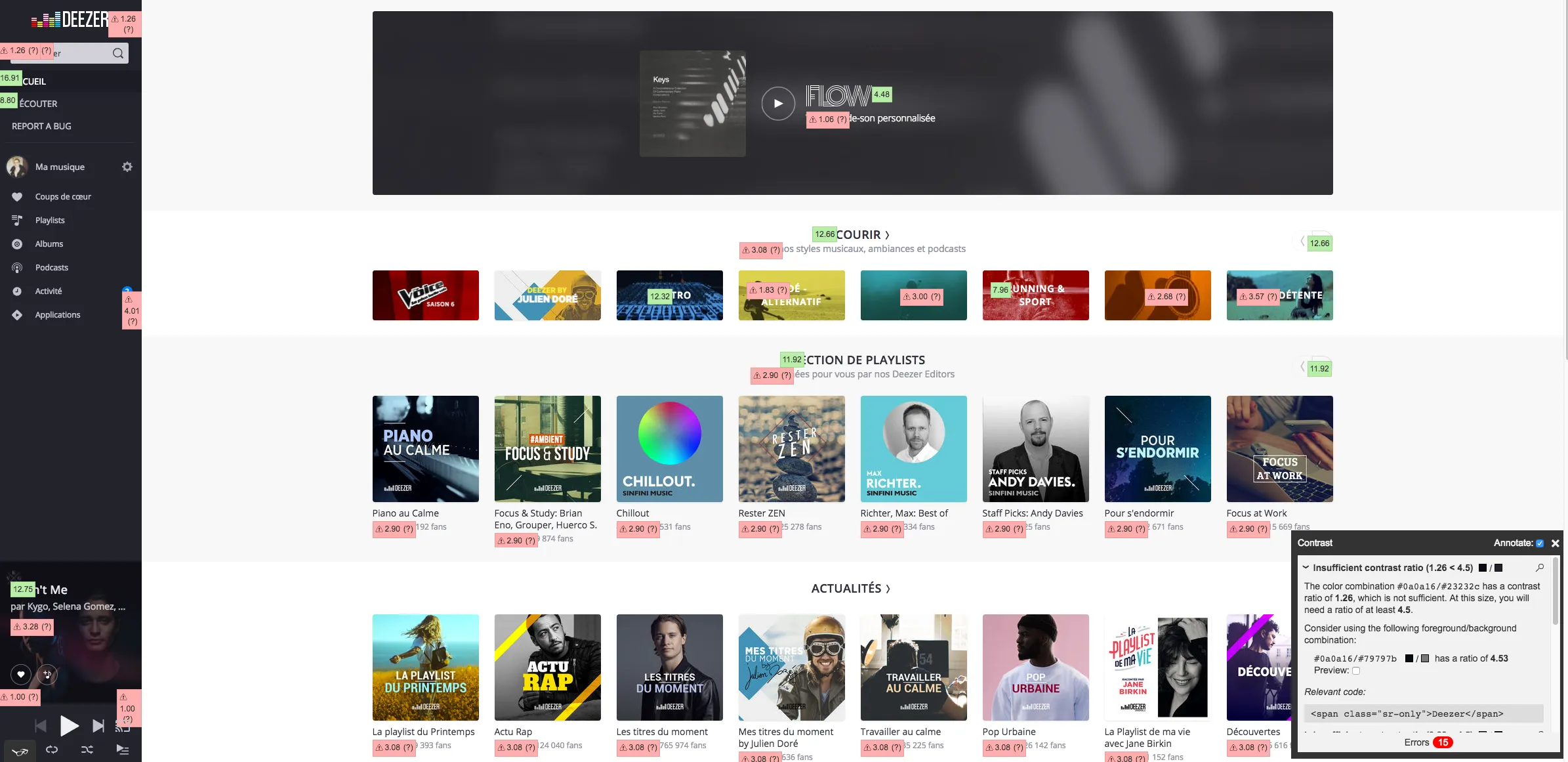
Another useful tool is the Chrome extension ChromeLens, with which you can view the site as it appears to users with a variety of visual disabilities or conditions.
Using both these tools, we worked with a designer to improve the color contrast of site headings and sub-headings. In addition, we added more impactful focus styles for search input fields and items in the left-hand menu. These were fast and simple changes that should ensure the majority of text-related contrast and focus issues are resolved. However, problems remain with the player itself:
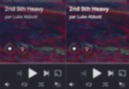
Although our contrast changes improve the legibility of the player’s heading and sub-heading, its icons still suffer from low-contrast and an insufficiently visible “rollover” style. These issues, along with accessibility in general, are now being used to inform an upcoming redesign of the web player. It illustrates how making your web app accessible is an ongoing process, requiring continuous attention, rather than a single set of definitive changes.
In the final article in this series, I’ll focus again on the web player, explaining a little about how we made it and related components more accessible during a recent Hackathon at Deezer.
