

Accessibility Part 3— Improving Keyboard Navigation on Deezer.com
The keyboard is the primary input device for the visually-impaired, those with motor-disabilities and even so-called “power users” who may find keystrokes faster than using a mouse. The visual layout of a site has no bearing on how easy it is to navigate with a keyboard; what matters is the choice of HTML tags and the sequential order of the content.
In this article I’ll explain how keyboard navigation works and share some of the steps we took to improve the keyboard accessibility of the Deezer website. Just like our work with screen readers, these changes improve the site for everyone, disabled or otherwise, and will be further refined as we move to testing with real users.
Focusing on an element
When you click a link or place the cursor in a text field, the element is said to have focus. You can see what’s currently in focus by opening your browser console and executing the command document.activeElement.
When a page is loaded for the first time, document.activeElement will be the <body> tag. A user can press the tab key to move the focus from <body> to the next tabbable element in the page. What is considered tabbable — meaning, an element that is keyboard focusable — differs between browsers. In general, form controls and links with href attributes are able to take keyboard focus, along with elements that possess a tabindex attribute with a non-negative value. If no element is in focus, document.activeElement will equal <body> again.
<!-- tabbable -->
<a href="https://www.deezer.com/"></a><!-- tabbable -->
<a tabindex="0"></a><!-- not tabbable -->
<a href="https://www.deezer.com/" tabindex="-1"></a><!-- not tabbable -->
<a></a>
The tab order of a website is the sequence in which elements are given focus as the user hits the tab key. This order is determined by the position of the element in the document (earlier take precedence) and the value of the document’s tabindex attributes (higher values take focus first). So the active element that follows <body> will be either the next tabbable element in the document’s HTML or the first with the highest non-zero tabindex value, if such an element exists.
The browser will, by default, draw a visible outline around the currently active element —regardless of whether the focus is placed via the mouse or the keyboard. The appearance of this outline differs between browsers. Firefox, for example, adds a subtle dotted border; Chrome displays a blue halo. For this reason, designers often remove the focus outline to ensure a consistent look across all browsers. This makes it impossible for users to determine which element is currently in focus, something that is critical for anyone who relies on keyboard navigation.
We’ll examine focus outline and color contrast in a future article; in the meantime, I’m using a Chrome extension called Focus Indicator to add a bright visible outline to the currently active element.
One unfortunate exception to these rules is Firefox on MacOS. By default, the MacOS keyboard accessibility settings allow focus to be placed only on form controls and lists. Chrome and Safari manage their own a11y configuration, but Firefox uses the system one, meaning that the user is unable to use tab to place the focus on a link, regardless of the presence of tabindex or href attributes. The user can change these settings by going to System Preferences -> Keyboard -> Shortcuts -> Accessibility and selecting All Controls but there’s currently no way to force this behavior in the HTML.
Performing an Action
If the active element is a form control or an anchor tag with an href attribute, we can submit the form, follow the link or fire its event handler by pressing the Enter key. In the case of a <button> we also have the option of hitting the space bar.
A tag can otherwise be made tabbable by giving it a positive tabindex attribute, but it will only respond to keypresses if the callback associated with its event handler is modified appropriately, as we’ll see later.
Custom components such as volume sliders should respond to the directional arrows — “up” or “right” to increase the value, “left” or “down” to decrease it. In addition, WAI guidelines recommend that the “page up” and “page down” keys should increase and decrease the value more quickly, whereas “Home” and “End” should respectively jump to the minimum and maximum values allowed by the component.
Modal dialogs, tooltips or contextual menus should allow themselves to be dismissed using the Escape key.
Improving Keyboard Navigation
#1 — Think about HTML sequential order
This step is easy to reason about but, sometimes, tricky to apply to legacy code. Tab order, just like the order content is spoken by a screen reader, is largely determined by the sequential placement of elements in the HTML. This position is often chosen to more easily allow a CSS float to be applied in order to achieve a visual effect.
For example, consider a track “card”:
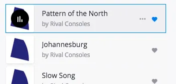
We want to give sufficient context to the user, so our desired tab order is: (1) track title, (2) artist name, (3) play button, (4) favorite icon, (5) context menu icon. However the underlying HTML is ordered as follows: (3) play button, (5) context menu, (4) favorite button, (1) track title, (2) artist title.
One possible solution is to keep the HTML as is, but to set tabindex values on each part of the card — a tabindex of 1 on the track title, 2 on the artist name etc. This is a really bad idea. If all other elements on the page have a tabindex of zero or less then the uppermost card’s track title will become the first element that takes focus after the <body> tag. If we adjust all preceding tabindex attributes to compensate then we need to do this every time the card component or page layout changes. For this reason it’s recommended to set tabindex to -1 for something that should never take focus, and to zero otherwise.
The best solution seems to be to change the structure of the HTML and to adjust the CSS accordingly. However, like everything in practical web development, a compromise must be found between the perfect solution and what is possible within the time given. We decided instead to use the aria-label attribute to provide additional context to the play button, and to keep the HTML as it is. This was because the card CSS is fundamental to a number of other components, so we felt a less invasive solution was best for the moment. Keyboard accessibility will be a consideration from the start for all future developments.
Other parts of the site were less problematic to fix. But, as with accessibility in general, developing for keyboard navigation is a long-term process rather than something that can be corrected in one go.
#2 — Use standard form controls and anchor tags
As we’ve already seen, form controls and anchor tags are, for the most part, automatically tabbable and accessible via the keyboard and should be used in preference to other HTML tags.
In general we should try to use an <a href> for an action that changes the URL; a <button> should be used otherwise.
#3— Make custom components accessible with tabindex and onKeyDown
If a link or form control can’t be used, we should still ensure that the component is focusable and responds to keypresses.
For example, consider the following React component and its event handler callback:
render() {
 return (
  <span onClick={() => this._showAlert}>
   Show Alert
  </span>
 );
}_showAlert(e) {
 alert('Hello');
}
This component responds only to mouse clicks; moreover it lacks a tabindex and so isn’t in the document tab order. To address this, we make the following changes:
render() {
 return (
  <span role="button" tabIndex="0"
   onClick={() => this._showAlert}
   onKeyDown={() => this._showAlert}>
   Show Alert
  </span>
 );
}_showAlert(e) {
 // Respond only to Enter keypresses
 if (e.keyCode && e.keyCode !== 13){
  return;
 } alert('Hello');
}
The _showAlert callback is invoked by either a click or keypress on the element. If the keypress is anything other than the Enter key, signified by keyCode value 13, we return and allow the event to continue as usual.
Without this keyCode check, the user would be unable to press tab to move to the next element in the document as any keypress event would invoke the callback, open the alert box and trap the keyboard focus.
This is something to keep in mind if you need to disable the default action of an element using e.preventDefault — always place this after the if statement or you risk blocking the default action of all keypresses.
#4— Don’t interfere with default key combinations
Deezer provides a number of keyboard shortcuts that make it easier to control the Player — open the Deezer home page and hit the h key to see the full list:
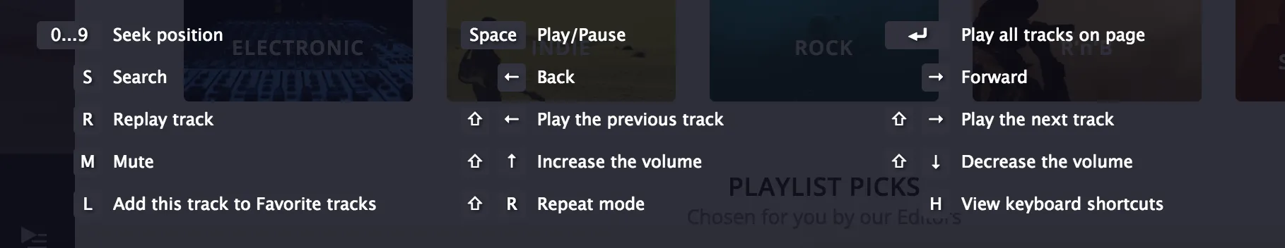
Some of these shortcuts interfere with the default behavior of the browser when using the keyboard. For example, the space bar plays the current track rather than invoking an action on a button. The Enter, left arrow and right arrow keys are similarly bound to Player actions.
To fix this, we simply changed the keyboard shortcuts, adding shift or alt combinations where appropriate.
The space bar is something we couldn’t change; users expect it to play the current track, something they’re used to from players like YouTube, Quicktime or VLC.
#5 — Manage focus programmatically, if necessary
Sometimes it’s necessary to intervene programmatically in the management of focus. For example, consider the “panel” that opens when you click the “cog” symbol in the left-hand menu on Deezer.com. Navigating with the keyboard, we want the component to work as follows:
- The user tabs to the “cog” icon in the left-hand navigation menu;
- The user presses the “Enter” key;
- The settings panel opens and the focus is placed on the first active element in the panel;
- The user presses tab to move through the setting options in the panel;
- Once finished, the user presses Esc to close the settings panel;
- Focus is returned to the “cog” icon and the user can continue to tab through the rest of the main navigation menu.
This behavior is impossible to achieve using HTML sequential order and tabindex alone so instead we make the following changes to the Panel component:
- The event that opens the settings panel contains a reference to the “cog” icon as
e.currentElementon the Event object. We pass this to the panel component; - The panel container is made tabbable with a zero-value
tabindex, acting as the first focusable element for keyboard navigation. A descriptivearia-labelis also added, giving an audible reference point to visually-disabled users when the panel is opened; - Panels can now be closed using the Esc key. When the user hits Esc, we return focus to the element
e.currentElement
Let’s take a look at the optimized site with all these changes in place:
Note how Focus Indicator highlights the active element with a green border. In the next article, we’ll look at focus outlines, color contrast and how to find a compromise between design constraints and accessibility.
