Accessibility Part 5

Earlier this year, Deezer hosted one of its regular Hackathons, giving developers from different teams the chance to collaborate on ad-hoc projects or fun ideas they might have been hankering to implement. Myself and Ahmed Abdellaoui, an iOS developer, decided to work on making the web and iOS players more accessible. As we would have to present our work, it seemed like the perfect opportunity to explain to Deezer staff and management why accessibility is important and how it can make the Deezer platform better for everyone.
In this final article I’ll focus on the web player, a standalone component that currently appears in the bottom-left of the Deezer.com interface, and how we made it more accessible. In many ways the issues resolved — bad labeling, keyboard navigation problems & content unoptimized for screen readers — act as a summary of the topics we’ve covered in the previous articles in this series.
Controls & Components
Our first task was to examine the content of the player — what its sub-components were, what HTML elements were used for each control and how these were labeled for the user (if at all).
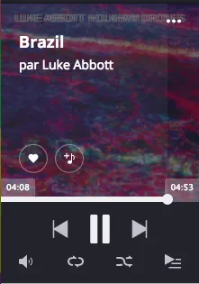
The web player is composed of the following elements:
- The album cover for the currently playing track, overlayed with the track title and artist name;
- Buttons that control favoriting, the creation of playlists and other advanced features;
- A “seek” slider that shows the current position and allows the user to seek to any point in the track;
- Standard back, next and play control buttons;
- A bottom set of controls for changing the volume, setting the repeat and shuffle states and a button to open the list of current and upcoming tracks.

To improve basic support for screen-readers and keyboard navigation, we first improved all labels, made sure simple controls were correctly represented by <button> elements, making them automatically accessible, and added :focus rules where :hover appeared in our CSS, as described in the previous article.
I then focused on two elements in the bottom set of controls — the repeat control and the shuffle button.
Take a look at this video, created for our Hackathon presentation, that shows the unoptimized site and player as read by a screen-reader.
At the 30s mark, note that the screen-reader speaks “Repeat — button” as we change the state from “Repeat none” to “Repeat all” to “Repeat one”. The shuffle button exhibits the same behavior — its current state cannot be known as the label is always set to “Shuffle”.
The solution in both cases was to improve the use of the aria-label attribute. In particular, the label should describe the future state of the button, rather than its current value. For example when repeat is turned off, the label should read “Repeat all tracks in the list”, as this is the action performed by selecting the button. When “all” is selected, the label should read “Repeat only the current track”, and so on. It might seem obvious, but our instinct is often to label controls by their current value rather than their value after the button has been clicked.
Speaking Assertively
Staying with screen-reader accessibility, we next tried to think a little about how a visually-impaired user might interact with the player.
For example, suppose the user was listening to a “mix”, a randomly selected playlist of thematically-related tracks. Such a user would only know the artist and title of the currently playing track if they manually moved the focus to the text at the top of the player component (or if they know the track already).
To accommodate such a user, we added some hidden text containing the artist name and the track title; in addition, we enclosed that text in an element with the attribute aria-live="assertive".
<!-- This content is only available to screen-readers -->
<span className="sr-only" id="player-track-info">
   <span aria-live="assertive">{trackTitle} by {artistNames}</span>
</span>
The contents of the inner <span> are updated dynamically when a new track starts. The aria-live="assertive" attribute tells the screen-reader to speak every change to this element, even if it has to interrupt itself to do so. The reader acts somewhat like a radio-show host, announcing the title as the current track changes before continuing with whatever it was previously speaking.
Accessible Sliders
There are two sliders in the Player component — the seek bar and the volume control. The WAI accessibility guidelines describe attributes and functionality changes that work to make a slider component more accessible to keyboard and screen-reader users alike — MDN has a good summary. In addition, we used the “Able Player”, a fully accessible music player, as an example of best-practices.
We began by marking up the slider using the correct ARIA role, label and slider-specific attributes. Below, a simplified example:
<div role="slider"
 aria-label="Seek position"
 aria-valuenow={position.toFixed(2)}
 aria-valuemin="0"
 aria-valuemax={duration}
 aria-valuetext={`${position} of ${duration}`}
 aria-disabled={!duration}
 tabIndex={!duration ? -1 : 0}
 onKeyDown={this._seekOnKeyDown} />
There are a few things to note here
- There exists a “slider” role in the ARIA spec, so we use it here, along with a label;
- The ARIA
valuenowattribute contains the current track position, to two decimal places, withvalueminandvaluemaxthe expected upper and lower limits. In practice, a screen-reader will ignore these in favour ofaria-valuetext. As we have only tested on VoiceOver, we include all attributes to ensure maximum compatibility; - The
aria-valuetextattribute contains the text spoken by the screen-reader as the user interacts with the component. In the real code, we localize and format the values; - If the track has a “falsy” duration (i.e. is empty or not yet loaded), we disable the component and set its
tabIndexto -1, so the slider is skipped during keyboard navigation.
We treat keyboard navigation in the _seekOnKeyDown callback:
- If the user presses the left or down arrow, we step back about 5 seconds in the current track. Pressing “Page down” jumps back 30 seconds;
- For right or up, we seek forward a 5 second step; “Page up” moves us 30 seconds forward;
- Pressing the “Home” button returns the user to the very start of the track. Pressing “End” moves the position to just before the end of the current track.
When navigating via the keyboard, a user will have access to the full range of expected functionality. While using a screen-reader, each of these position changes is spoken aloud. You can see a little of this functionality in the following video, again a part of our Hackathon presentation.
Similar changes were made by Ahmed to the iOS application and, following our presentation, Deezer decided to make accessibility an official corporate goal, meaning that accessibility will be a considering for all future mobile and web developments here at Deezer.


