


At Deezer, we are fully aware that the number one reason why users subscribe to our service is to access the depth of our catalogue of 50 million tracks. And for that the Search is key.
Some history
To provide a best in class user experience, the Search team at Deezer had been working on fine-tuning the ranking algorithm, displaying top results, integrating new types of content (users, podcasts, live-streams, etc.) and optimizing our spell-checking system.
However, we soon realized that it was actually our instant Search UX (i.e. displaying of results as a user types) that was hindering our optimization efforts in two ways:
- Having to deal with prefix search
- Having no opportunity to help the user formulate their need except handling errors
This resulted in an overall affected user experience.
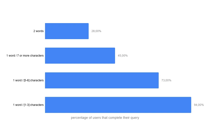
We started investigating whether users completed their queries before clicking on a search result. As an example, we wanted to know: when a user searched for Eminem, did they type the whole “eminem” query or did they stop at the character that triggered the retrieval of the right artist in the search result (the first character in this case)? The results, especially for one word queries (like “eminem”, “u2”, “rihanna”, etc.), were that a user tends to type the whole query.
This was also confirmed in a Google study showing that instant search UX for mobile is not relevant.
We launched Google Instant back in 2010 with the goal to provide users with the information they need as quickly as possible, even as they typed their searches on desktop devices. Since then, many more of our searches happen on mobile, with very different input and interaction and screen constraints. With this in mind, we have decided to remove Google Instant, so we can focus on ways to make Search even faster and more fluid on all devices.
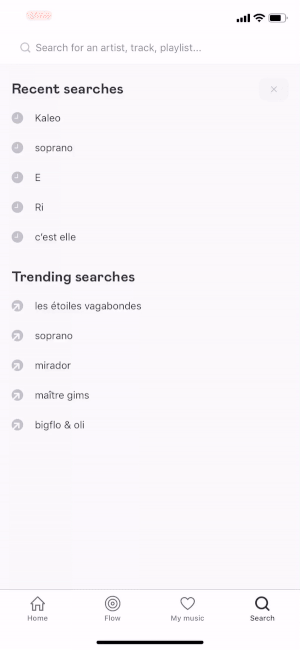
Based on these facts and learning from all the main actors who faced the same problem, we decided to provide a query suggestion feature.
A new search experience
To create this new search experience, we began by developing a query suggestion service with the following elements:
- Suggest query based on real searches & generated from music metadata (song, album, playlist and podcast titles, artist names, etc.)
- Localise suggestions according to the user country
- Suggest spelling corrections
- Personalise query suggestions according to the user’s musical tastes
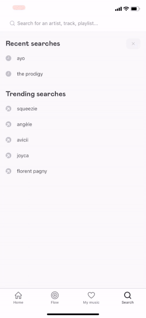
- Show previously searched suggestions (search history)
- Suggest related queries
Again, learning from the giants, to improve the UX we followed these design patterns:
- Avoid Scrollbars & Keep the List Manageable: no scrollbars and max 10 items.
- Highlight the Differences: it makes more sense to highlight the additions
- Support Keyboard Navigation: having the suggestion copied to the search field (only for Web UX)
- Match User’s Hover Expectations (only for Web UX): it’s important that the hovered autocomplete suggestion is highlighted and invokes the “hand” cursor
- Show Search History: a visited state adds an entire dimension to your site search history.
- Reduce Visual Noise: it’s important not to go overboard with the visual separators.
This new query suggestion UX allowed us to better understand what the user is actually searching for through their own query or a query that our system suggested to them. This means that if a user typed “Jim” and searched for it, we know there is a higher probability that they searched for the keyword “jim” rather than for keywords “jimi” or “jimmy”.
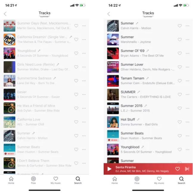
In order to add more precision, we developed a new search ranking algorithm giving more importance to an exact match than a prefix match. We added a boost to non prefix clauses and combined the BM25 relevance score with the item’s popularity calculated from the number of listenings.
At this point, we conducted usability tests with paying Deezer subscribers, asking them to complete a simulated work task:
“A friend of yours convinced you to check out Julien Doré. You’ve never heard of this artist but would like to listen to some of his tracks”.
Results: not one user commented on the fact that the instant search results were replaced by the query auto-completion feature. This was a good indication that no one would mind if instant search were to be replaced.
Getting the green light from our users, we opened the new UX and the new ranking algorithm to 50% of our Android users. We followed three metrics to evaluate the performance of the A/B test:
· Ranked Half-Life (RHL) indicator denotes the degree to which relevant items are located on the top of a ranked retrieval result.
· Success indicator describes the search session (i.e. a group of queries corresponding to the same need) where the user clicks on the last query of the group.
· Effort indicator includes the typing time, the considering time (i.e. the time for a user to click on an item after a query), the number of reformulations and the rank of the clicked items in a search session.
For the Success and RHL indicators, we saw that the new search UX and the original were essentially the same. However, there was a significant difference regarding the Effort indicator to the benefit of the new UX.
All in all, the new search UX did not have a negative impact on search satisfaction. On the contrary, users need to provide less effort to find the music they want to listen to!
Our team is glad to introduce this new search experience into the Deezer product.
The next steps consist in improving the query suggestion algorithm and tune the new search ranking algorithm, but also in continuing to improve the Search UX. We are currently working on a new design and user experience of the search results. Stay tuned!